Home » Mapotic blog » Data visualization on maps
There are many ways and tools to visualize data on a map. You may want to visualize a one-time data set, interpret dynamic data over a long period of time, or display data collected through forms and crowdsourcing. Mapotic can help you with all of this.
When preparing your data set, it is often necessary to divide it into groups or categories.
This requires us to think about the data visualization structure – usually we need multiple categories and there should be a set of attributes assigned to each Point of Interest (POI). A better defined category list and accurate classification of each POI will provide more operations and possibilities in the future. How data can be filtered and visualized is largely due to the data structure. For data visualization we typically use the following::
The most common visualization is marker-based or point-based data interpretation. There are many versions from typical markers to “auto scaled” points or dots.
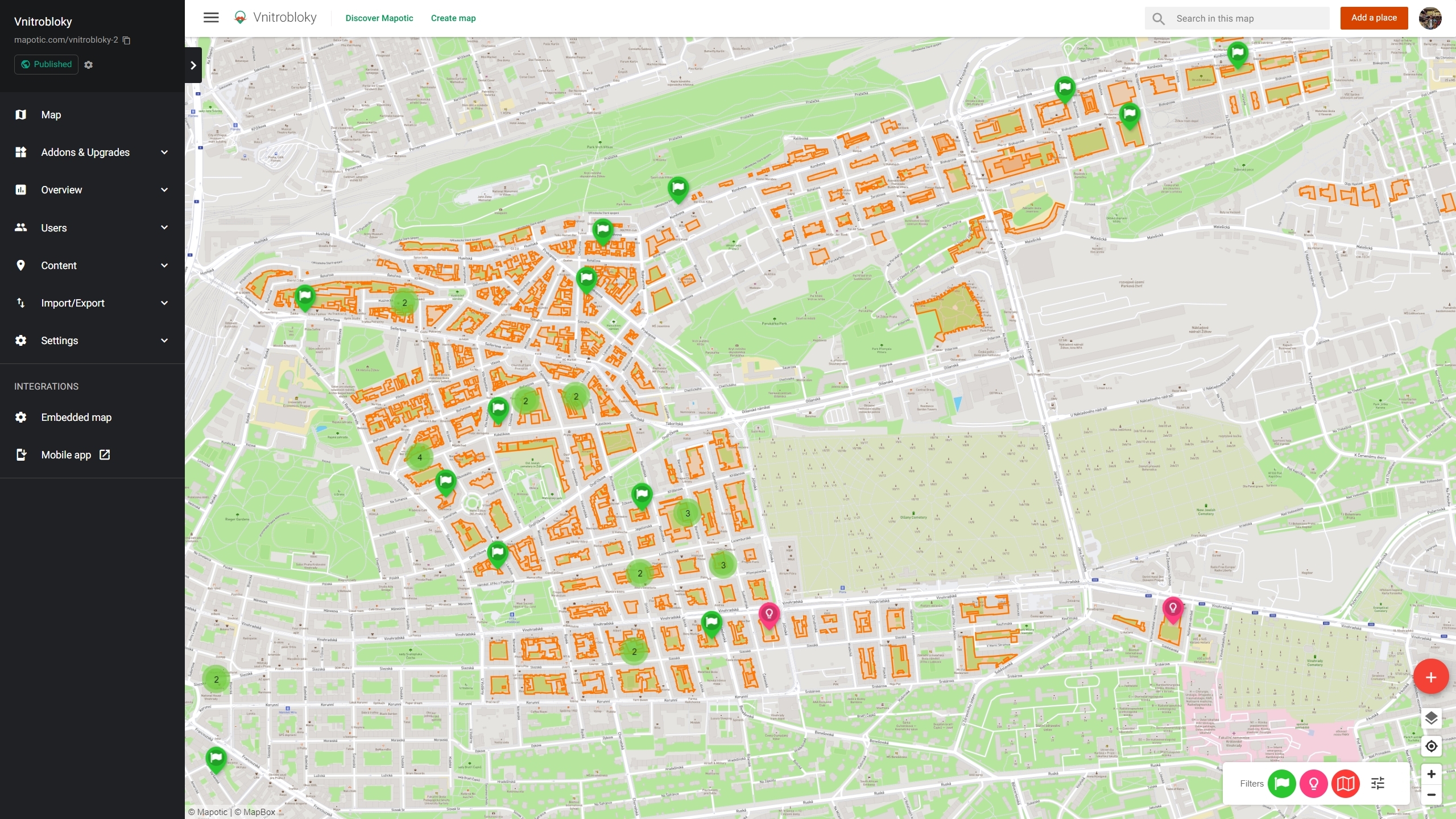
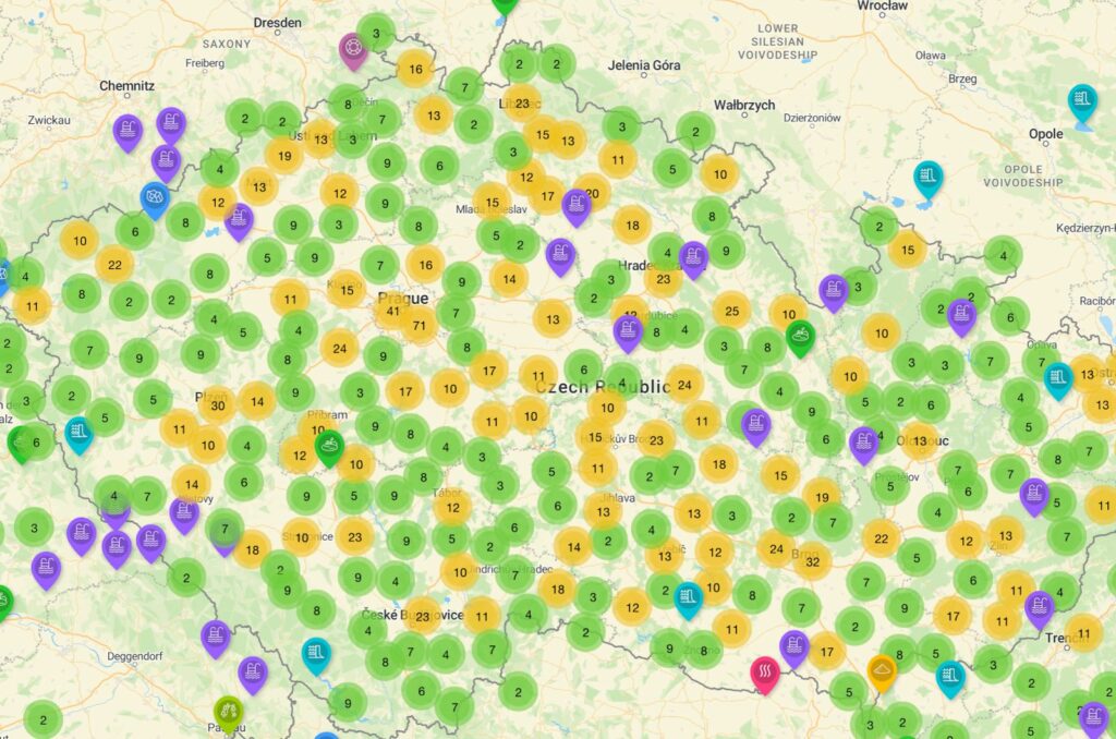
Typical Markers – traditional markers are commonly used to represent specific points of interest on a map. They are usually icons or symbols that convey the type of data associated with a particular location. For example, you might use different icons for restaurants, hospitals, or tourist attractions. This approach is straightforward and intuitive for users.
Auto-Scaled Points – to o enhance the visual representation of data, some systems employ auto-scaled points or dots. In this approach, the size of the point corresponds to a particular attribute, such as the magnitude of an event or the quantity of data at a location. Larger points may indicate higher values, allowing users to quickly identify variations in the data distribution.
Clustered Markers – in situations where many data points are close together, using individual markers can clutter the map. Clustered markers solve this problem by grouping nearby points into a single marker with a number or other indicator representing the number of points in the cluster. Users can then interact with the cluster to explore the data at a more granular level.
Mapotic offers two basic types of marker visualization. First one typical map markers with clustering. A major advantage of clusters is a better map-app performance once your map contains thousands of individual markers.
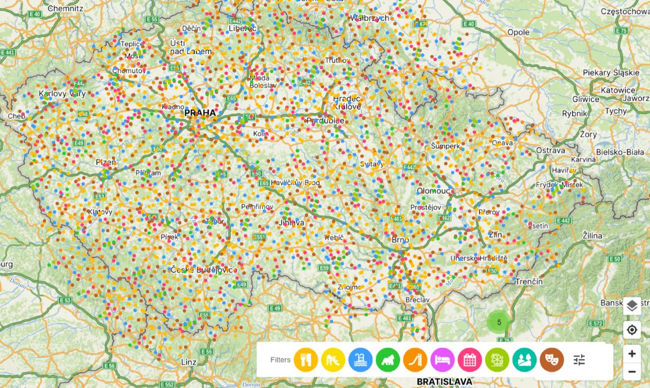
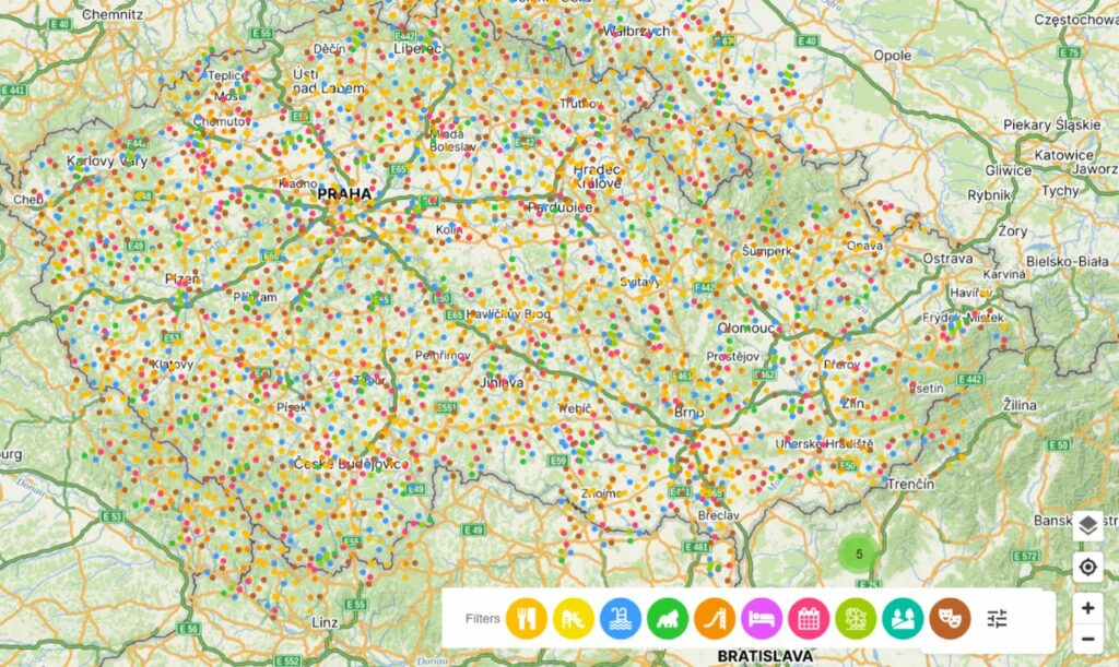
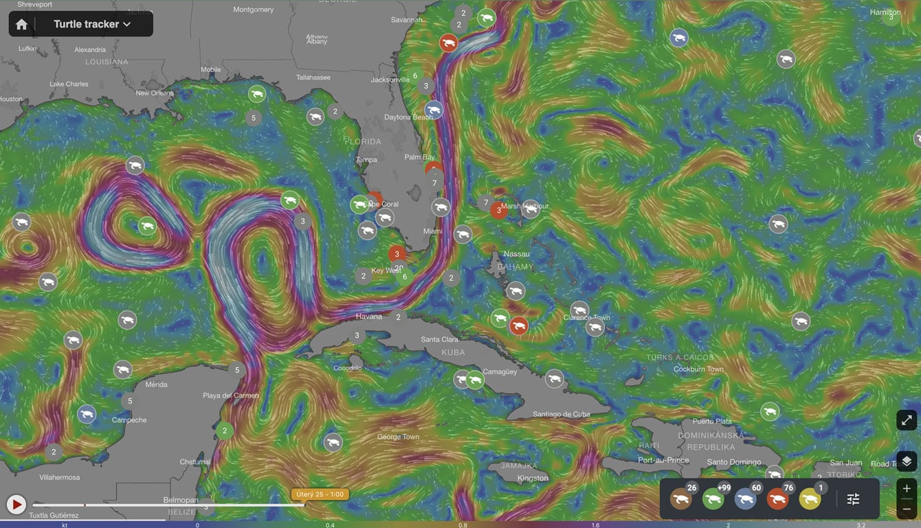
Soon, Mapotic will introduce a dot-based and autoscaled data visualization feature that handles large quantities of data points without the need for clustering. Using this data visualization approach, clustering is eliminated as the dots are scaled based on the map zoom. One of the interesting results is that when the map is zoomed out, users can see a “heat map-like” effect.
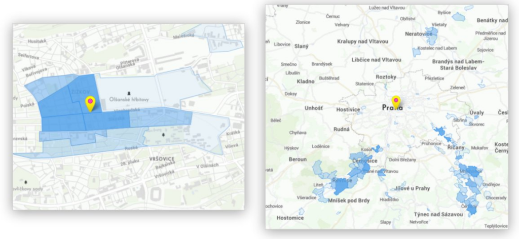
These grids are usually structured in either square or hexagonal patterns, each with its unique advantages. These grids serve as a foundational framework upon which various layers of Point of Interest (POI) data can be overlaid or integrated.
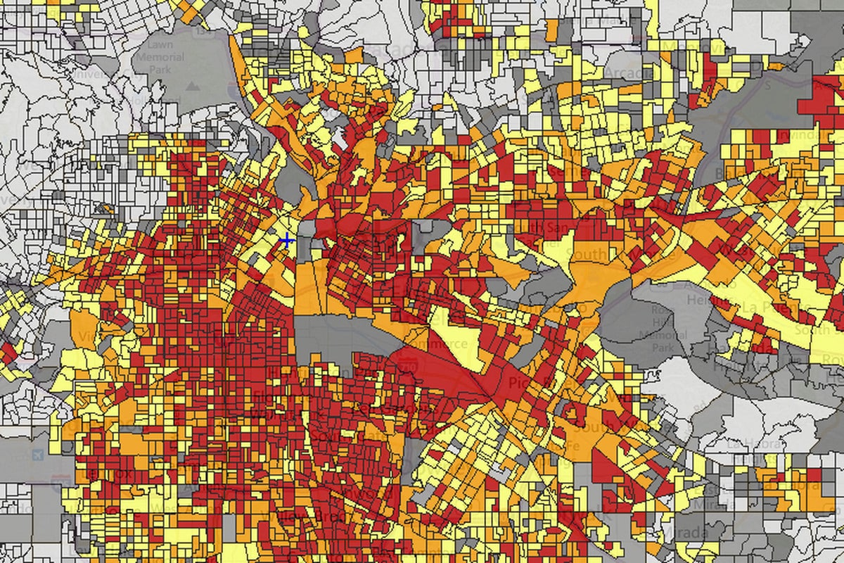
Square grids provide a straightforward and uniform way to divide a geographic area into equal-sized cells. This regularity makes them suitable for various applications, such as analyzing population density, land use patterns, or crime statistics. The simplicity of square grids allows for easy data aggregation and comparison across different regions.
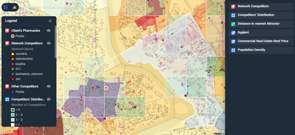
Polygons are one of the most used views after Points of Interest. It allows visualization of areas and can be combined with point-based map data visualization.
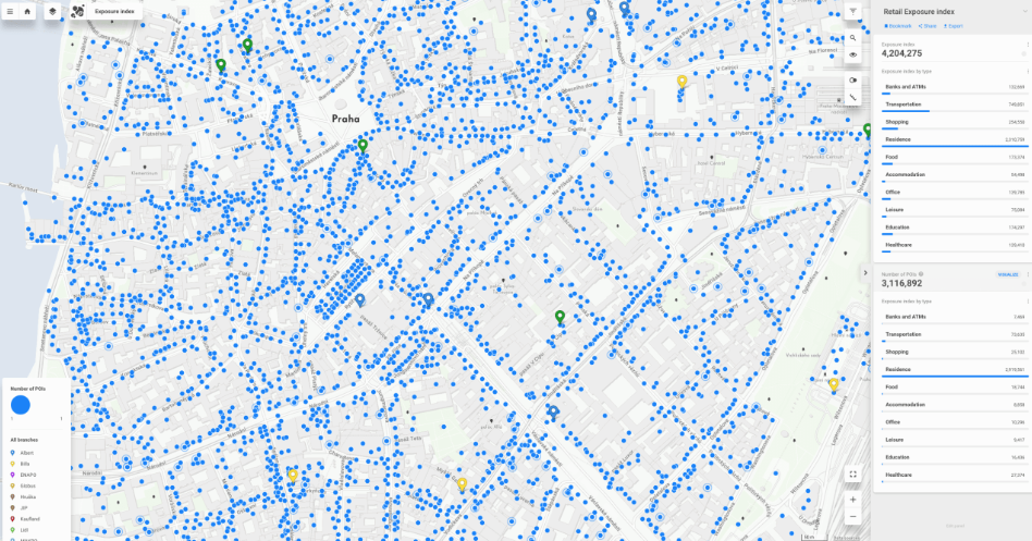
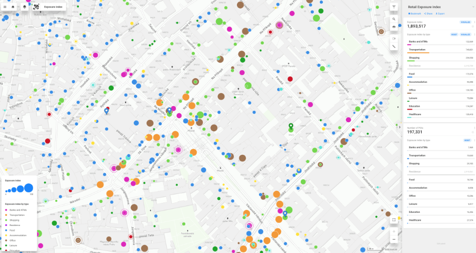
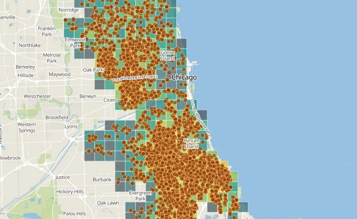
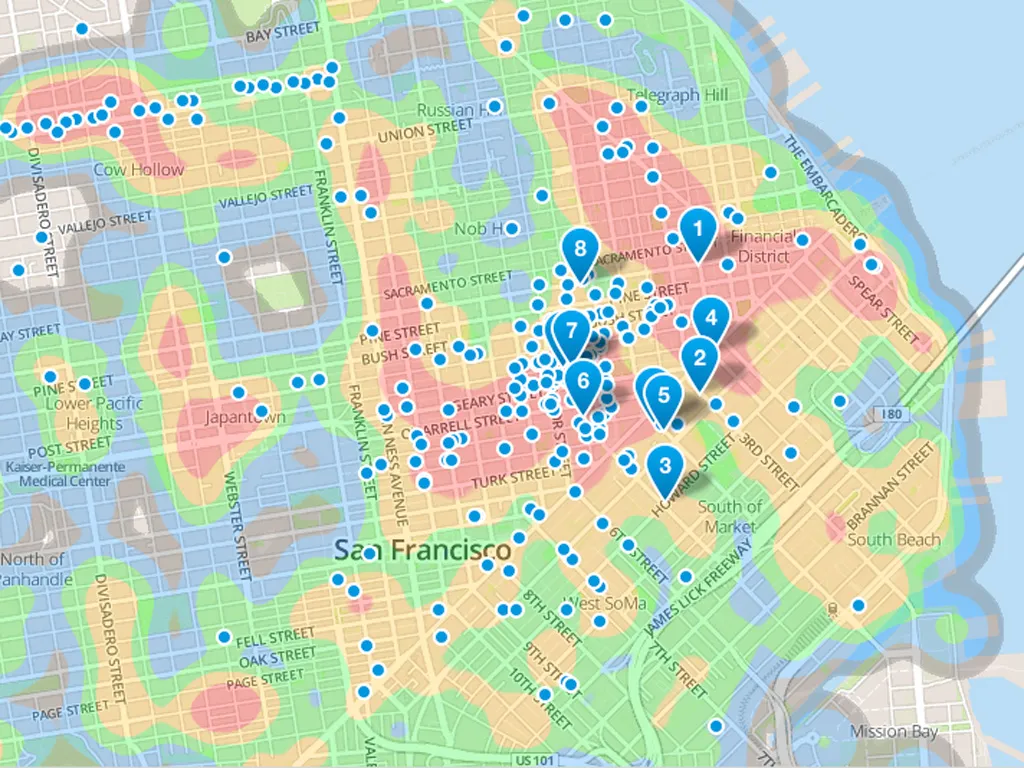
Heat maps are typically used in cases associated with demographics or psychographics. Heatmaps are another way to interpret point-based data. Rather than representing individual points, heatmaps use color gradients to show data density. Hotter colors (e.g., red) indicate areas with a higher concentration of data points, while cooler colors (e.g., blue) represent sparser regions. Heatmaps are useful for visualizing trends and patterns in data, such as crowd density in a city or the distribution of disease outbreaks.
Can be useful and visually appealing in use cases when planning specific areas at closer zoom levels. Below an example of visualizations created with Mapbox.
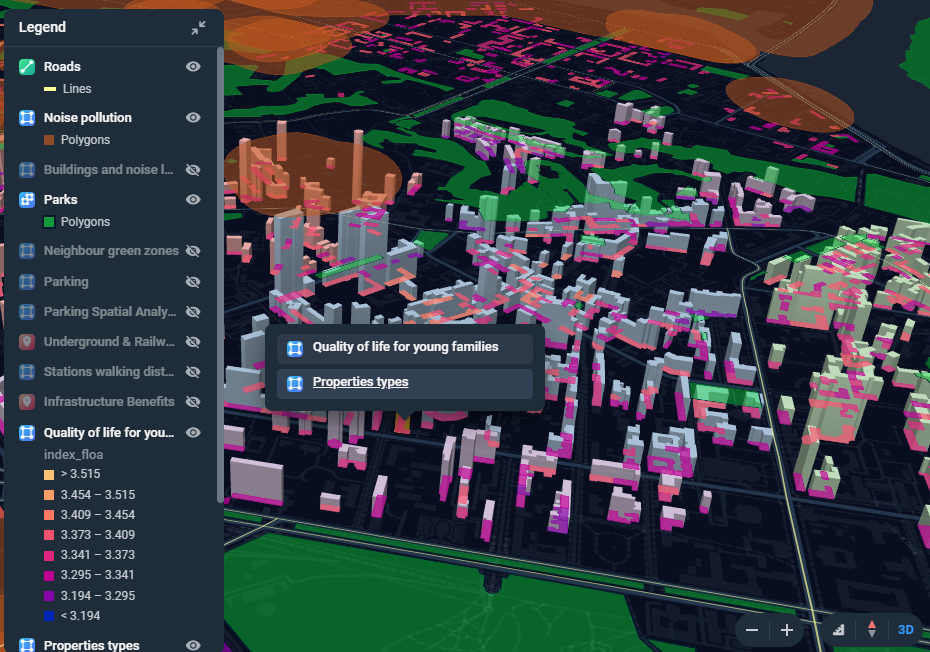
3D map views provide a more immersive and realistic representation of the environment. This level of detail can be invaluable for urban planners, architects, and developers when they need to plan specific areas. It allows for better understanding of building heights, terrain variations, and how structures fit into the landscape.
Enhanced Spatial Understanding – 3D map views provide a more immersive and realistic representation of the environment. This level of detail can be invaluable for urban planners, architects, and developers when they need to plan specific areas. It allows for better understanding of building heights, terrain variations, and how structures fit into the landscape.
Aesthetic Evaluation – or architectural projects or landscape design, 3D maps help in visualizing the aesthetics of an area. This is crucial when planning developments in historic districts, scenic landscapes, or areas with strict design guidelines. Stakeholders can assess how new structures will impact the visual appeal of the surroundings.
Topographical Analysis – in areas with varying terrain, 3D maps are essential for assessing slopes, drainage patterns, and potential challenges related to land use. This is vital in projects such as ski resorts, urban development on hilly terrain, or floodplain management.
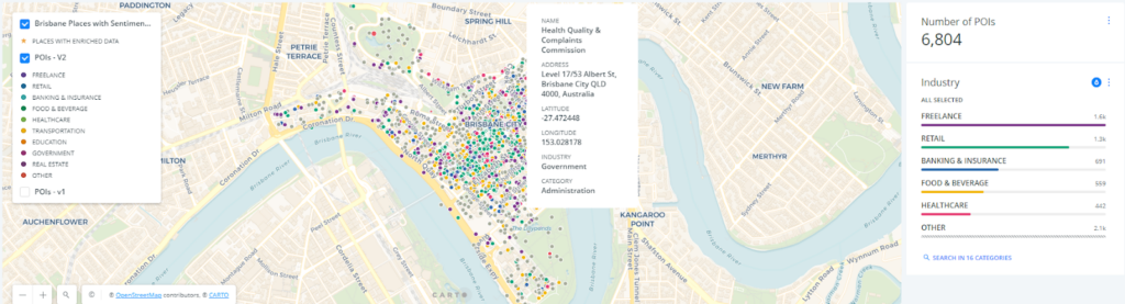
The following map (Data Appeal) works with categorized points of interest that are visualized heat map-like. This allows users to browse and filter by category of interest and click on specific points to get more information.
An example of combining multiple data tools in one view:
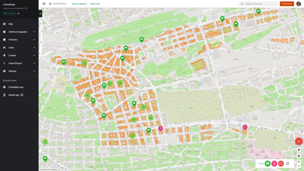
The most common ways to prepare and manage data for map visualizations are XLS files and cloud based Google Sheets (learn how to Create maps from Google sheets). Based on your data set, you need to create columns with information that will be displayed in each location. Locations are in rows and you can use ordered lists or multiple select to prepare data which will create automated filters as described in our data preparation article.
Check our solution for Map data visualization via Google sheets. The beauty of this integration is that the connection is persistent and anything you change in the sheet is automatically visualized in the map.
It can be also used for changing or updating information within existing locations on the map. To find out more, get in touch with us!

Helping hundreds of students discover the frontiers of the cosmos.

A mobile application with thousands of multilingual travel tips helps…
Mapotic and Hardwario cooperate to display sensor IoT data in…

Develop web or mobile tourism apps with updated, relevant datasets that inspire and offer unique experiences.

Support wildlife exploration and protection by providing wildlife tracking systems and tracker apps
Drive environmental projects with our technology, merging data visualization and technology to balance human and nature interactions.

Build social impact projects to connect those in need with helpful resources, meaningful aid & community support.
Improve quality of life in public spaces through smart city development and active citizen feedback

Bridge people with shared missions through collaborative and community centered interactions